

The Right Way to use Brand Colours in your Store
How to use tints, shades and variations of your brand colour to give your Shopify store depth without going off brand.
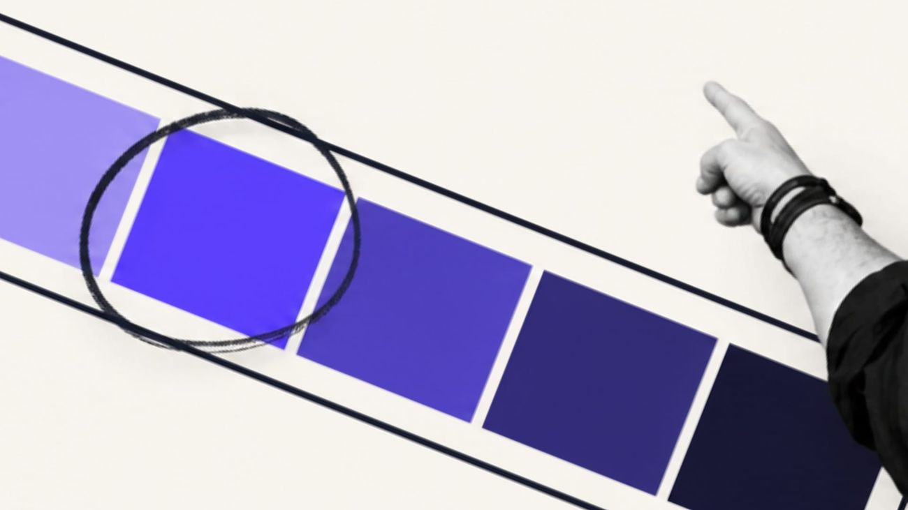
Most brands have one colour they’re known for and most Shopify stores use it in one of two ways...
Store one
The first store puts the brand colour on everything: the announcement bar, the header, the headings, the buttons, the badges, the footer.
It’s on brand. It’s also flat, because when everything is the signature colour nothing stands out, the add-to-cart button included.
Store two
The second store is so afraid of getting it wrong that the brand colour lives in the logo and nowhere else. White page, black text, grey buttons. It’s clean, and it could belong to anyone.
Both stores have made the same mistake. They’ve treated the brand colour as a single hex code in a brand guideline. But when we use it properly, it’s a whole family of related colours, and each one has a job to do.
What’s in the family?
Every colour has relatives.
Mix it with white and you get a tint. Mix it with black and you get a shade. Mix it with grey and you get a tone, the quieter, more grown-up version of the same colour.
Push the lightness or the saturation up and down a few steps and you’ve got six or eight colours that all read as the same brand, because they share the same hue, the same brand colour.
Let’s say you’re a jewellery brand and your colour is a deep emerald. The family might look like this:
- warm ivory for the page background
- a pale green tint for an editorial section or the back of a product card
- mid emerald for links, selected filters and small details
- dark emerald for the footer and the primary button
- a near-black green for body text and navigation
- emerald at low opacity for borders and dividers
Nobody visiting that store sees six colours. They see one brand with a refined colour palette.
The trick is to change the lightness and saturation while leaving the hue alone.
Where does each one go?
The 60-30-10 rule comes from interior design and it works beautifully on a Shopify store. Sixty per cent of what the customer sees is the dominant colour, thirty per cent is secondary, and ten per cent is the accent.
For a premium fashion, beauty or jewellery brand I’d lead with neutrals and let the imagery do most of the talking. The 60 is the canvas: ivory, warm white, greige, or near-black if the brand is dark. The 30 is the tonal family, in section bands, cards, the navigation and the footer. The 10 is the signature colour at full strength, kept for the moments that matter.
Why so much neutral? Because your product’s the most important colour on the page. A gemstone, a printed silk, a lipstick swatch on real skin - they all need a quiet background to look the way they look in the hand. An interface that competes with the photography loses, and so does the product.
Nobody has proven the ratio lifts conversion. But there is a use for it: it stops every colour shouting at the same volume.
The UX principles behind it
Colour does a specific job for the customer, and there’s a handful of usability principles that explain it.
Common region
Things that sit on the same background read as a group. A pale tint behind your size guide, delivery and returns information tells the customer those three belong together before she’s read a word. Alternating a neutral section with a tonal one down the homepage breaks a long scroll into chapters.
Isolation
The item that’s different from everything around it gets noticed and remembered. Psychologists call it the von Restorff effect. Your add-to-cart button only benefits from it if its colour is rare on the page, which is the strongest argument for keeping the full-strength accent to about ten per cent.
Signifiers
Colour tells the customer what’s clickable and what state it’s in. Hover, pressed, selected and disabled are four different jobs, and the colour family covers all of them. A hover goes one step darker, a pressed state another step, a selected variant swatch gets the brand shade plus a border. Every state comes from inside the family.
Consistency
Once a customer learns that dark emerald means “do this”, it should mean that on every page, in the cart drawer and in the reviews widget. When the same colour means “buy” on the product page and “read more” on the blog, she has to stop and work out what each button does.
Contrast
The WCAG accessibility standard asks for 4.5:1 contrast for normal text and 3:1 for large text and for buttons, borders and icons against what’s next to them. A lot of brand colours fail. White text on a mid-tone brand colour, grey body copy on ivory and gold text on white are where most stores go wrong. And an out-of-stock size needs a strike-through or a label as well as going pale, because some customers can’t see the difference in colour at all.
Keep a brand colour that fails contrast for decorative surfaces. For anything the customer reads or clicks, build an accessible shade from the same family. The guideline doesn’t need to change, and the store works for the one in twelve men with some form of colour blindness.
What colour should the add-to-cart button be?
It should be the only colour of its kind on the page.
The most-quoted button test in ecommerce had a red button beating a green one by 21%, and it’s been used ever since as proof that red converts. The page it ran on was mostly green. The red button won because it was the only red thing on the page, which makes it a test about contrast and isolation, and says very little about red.
So start with the strongest accessible colour in your brand family and check that it stands apart from what surrounds it. A beauty brand built on sage greens probably shouldn’t put a sage button on a sage section. What could work better would be a dark plum, a charcoal or a much deeper green that maintains the brand but makes the button stand out from everything else around it. If you want to know for sure, test your brand action colour against a higher-contrast option with the copy, size and position held still, and judge it on completed orders, not clicks.
How do you set it up in Shopify?
Shopify’s themes are already built for a colour family.
Most Shopify themes work in colour schemes. Each scheme is a set of background, text, button and border colours, created once in Theme settings and then applied section by section. For most premium brands three schemes and one action colour cover it. A light neutral carries the product grids and most of the product page. A soft tonal scheme takes the cards, testimonials and story sections, a dark scheme the footer and campaign moments, with the action colour inside all three.
Horizon, the latest core theme Shopify now puts on new stores, added colour palettes from version 4.0. You name your brand colours once, and every setting that uses one updates when you change it. It’s the closest Shopify has come to keeping a brand’s colours in one place, and it’s worth setting up properly from day one.
Where it goes wrong is usually around the edges. A reviews app ships with its own yellow stars and blue links. A loyalty widget brings a purple. A freelancer hard-codes a hex that’s two shades off the brand colour into a landing page because it was quicker. None of it is a disaster on its own, and two years later the store has fourteen greens and nobody can say which one’s right.
That’s an operations problem. So how do you fix it?
Write the family down: the approved hex values, which job each one does, which pairs pass contrast, and what the hover and focus states are. Put them into the theme settings, keep them out of custom CSS, and style every app to match before it goes live. Then check the live store against the list twice a year.
What to do this week
Open your store on your phone and scroll the homepage, a collection page and a product page.
Count how many distinct colours you see that aren’t in your product photography. Then find the add-to-cart button and check whether it’s the rarest colour on the page, and run your three most-used text and button pairs through a contrast checker.
How much of your brand colour’s family is your store using?


Discussion